Showing posts with label Ranger. Show all posts

Tuesday, July 12, 2016

The Ornament of a House

Deb here with my first post as a member of Susan's Creative Team. I am thrilled beyond words to be here and work with all of my talented team-mates. For July, we are honoring HOME SWEET HOME and all that it means to us. A lovely Ralph Waldo Emerson quote says "The ornament of a house is the friends who frequent it". As I have been getting to know Susan and her team, I felt like I was home, surrounded by friends. Susan has some house stamps that went perfectly with our theme so I decided to create a bulletin board to keep me on track with my team posts. I used a vinyl chalkboard bulletin board that I have been hoarding and adhered it to the closet door in my studio. 
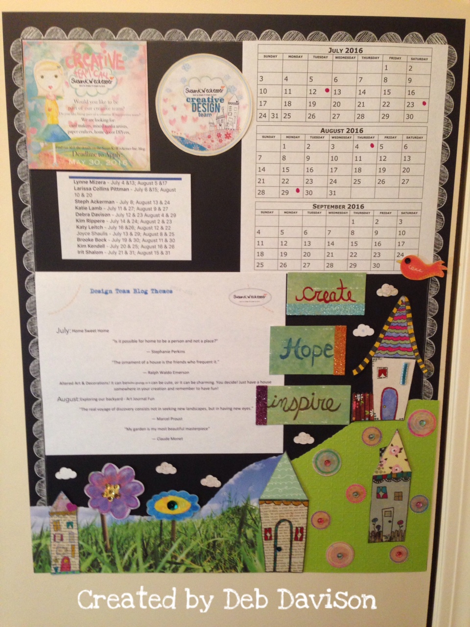

I started off by stamping several of Susan's house designs using my new favorite ink--Susan's Colorbox Color Pop Archival Dye Ink in Mystery. I used paper from my scrap drawer as well as some adhesive-backed fabric scraps for the roofs. I then fussy-cut the houses and colored them in with an assortment of  Faber-Castell PITT Artist pens and Tim Holtz Distress markers.


Another technique that I often use is to apply ink to an acrylic block, then color using my Water-brush pens. For the door and  roof of one house, I used the Color Pop Premium Dye Ink in Sky. And to add some texture, I used a piece of ribbon over a window for a curtain. The fence is paper-pieced with some  Simple Stories paper.


The Painted Sentiments stamp set by Susan has some of my favorite words in it.I chose Create, Hope & Inspire to add to my board. Perfect words as I begin my journey with my new team. They were stamped in Colorbox Color Pop inks - Kiss, Sky and CocoaTim Holtz Distress Glitters  of Tumbled Glass, Spiced Marmalade and Seedless Preserves were used to highlight the words. Clouds were punched out of Susan's Bouquet paper and the words were stamped on Live in Color. The circles were punched from Color Burst paper and I added some DoubleClick Skittles in their centers for added dimension. Ranger Distress Stickles Glitter Glue in Icicle and Peacock added a fun touch to the house..


A few other creative touches : a sequin as a doorknob, white polka-dots made using my Signo Uni-ball White Gel Pen, and scrap adhesive-backed fabric paper-pieced for the roofs.


I absolutely LOVE to color and paper-piece and these houses are the coolest stamps to color !! Flowers were cut from Susan's paper - Live in Color. Sequins were again added at the flower centers.


I had so much fun making this project -- my first one with Susan's fabulous Creative Team !! I hope that you enjoyed it too and will continue to follow all of us here.  I also have posted about this project on my blog-  Meticulosity. And the next time you sit down to create something, think about what HOME SWEET HOME means to you. I would love to see what you come up with.

Stamp Sets Used :


Debra Davison
Susan K. Weckesser Creative Team Member


Friday, June 5, 2015

Wonky Street Book Cover


Hi Susan K. Weckesser fans! Dana Tatar here sharing a colorful book cover today. This journal cover was super fun to put together! I paired Susan K. Weckesser whimsical patterned paper and stamps with the Wonky Street Book Cover Kit designed by Neil Walker. I painted the cover with Ranger acrylic paint and added some textured designs with the Susan K. Weckesser A Little Bit Washi Stamp Set. I cut the sun and clouds from Susan K. Weckesser patterned paper and added a bit of doodling around the edges. I secured the houses to the book cover with adhesive foam for added dimension. Susan's papers make super colorful backgrounds! I added numbers and mini people to each house. The sentiment from Susan's What's Up Gnomey? Stamp Set was the perfect finishing touch.

I'm planning on filling this book with photos from my neighborhood get-togethers. Thanks for stopping by today!

~Dana Tatar - Susan K. Weckesser Creative Contributor

Wednesday, July 16, 2014

Outdoors Layout - featuring UmWow and Core'dinations

This past March we took the kids to Pedernales Falls just outside of Austin, Texas.  My husband remembered going there as a child and since moving to the Austin area we took the first chance the weather gave us to go.  It was beautiful, domes of limestone caved out by the water creating pools that gathered water and spilled out over more domes of limestone.  You could not go in the water as there was no easy way to rescue anyone if they were in trouble, plus flash floods can happen so fast.  We hiked all over the domes, but the boys favorite part was to throw rocks into the pools at the fish, and some were huge!!


I then layered the punch Khaki Glitter cardstock on top of Core'dinations Neutrals Cardstock (tan and brown), these matched up perfectly.  I then added in splatters of Distress Stain and the Chain Stencil from Susan K. Weckesser with Prima Ink in dark brown.  I also added in one of the wonderful banner Susan K. Weckesser Stamps in black ink around the page for more dimension.


Here you can see a close up of the Susan K. Weckesser Stamps and the UmWow Chipboard Hearts and arrow, and Cattail in the following pictures.


The kids has so much fun playing in the outdoors, looking for bugs, throwing rocks, hearing all the sounds, and just being kids.  It is those small things I love to capture!!

Supplies Used
Ink/Stain - Prima and Ranger
Trim - Other
Adhesive - 3M
 Enjoy!!

Wednesday, June 18, 2014

Flower Gift Box

I found this wonderful gift for my son's teacher, but I hated to just give it to her in a plain box or bag.  Why not liven it up and make the box just as much apart of the gift as the gift itself!?!  


Susan K. Weckesser's papers are just perfect of this project.  They have such fun and bright colors and just scream HAPPY!!  I used the "Live in Color" paper line and cut off the bottom left section to fit over the lid of the box (4 x 5 x 1 inch jewelry box).  A corner of the larger orange flower remained in the cut section so I turned it into the sun by adding in some Stickles.  I then added in more Stickles from Ranger to the other flowers and stems to brighten it all up. 

http://www.susankweckesser.com/welcome


The reverse of the paper is this lovely green color with lots of distressing.  I cut the paper to fit the sides of the top lid, sides of the bottom, and the entire bottom of the box as well.  I then inked the edges of the box in green chalk ink soften the entire look of all the edges. 


I used a punched strip of paper from a edge punch and lined it up along the edges and used a white gel pen and drew in the negative space of the stencil to create the pattern on the sides of the lid.  I then added in a little bling for fun.


Don't forget to give your teachers a little extra love, they do so much for your kids!!

Supplies Used
Paper - Susan K. Weckesser
Punch - Just Imagine
Pen - Jelly Roll
Gems - Recollections
Glitter - Ranger
Ribbon - May Arts Ribbon

Enjoy!!

http://scraps-of-reflections.blogspot.com/

Friday, June 6, 2014

Thank You - For a Teacher

The end of the school year has come and I want to thank the oldest son's teacher for all she has done for him this year.  Nothing says "thank you" more than something made from the heart.


I took Susan K. Weckesser's wonderful paper line "Beautiful Daydreams" and cut out a section of it in the bottom left corner.  I then took similar shapes of the flowers and butterflies and but them out to pop them uo on top of the existing ones in the paper.  Lastly, I used stickles in corresponding colors to accent the flowers, butterfly, thank you emblem, and stems.

http://www.susankweckesser.com/welcome

Don't forget to thank a teacher today!!

Supplies used
Patterned Paper - Susan K. Weckesser
Cardstock - Core'dinations
Punch - Just Imagine
Glitter - Ranger
Stamp - Recollections
Ink - Ranger
Adhesive - Scotch

Enjoy!!
http://scraps-of-reflections.blogspot.com/

Thursday, April 3, 2014

Easter Eggs Layout

Hello scrappy friends!  It's Lee-Anne here and today I am sharing an Easter layout for Susan K. Weckesser using some of her fabulous papers from the Live In Color Collection as well as Susan's stencil.


For this layout I started with a piece of white card stock and used a toilet paper roll and sprayed through the roll with Heidi Swapp's Colorshine Mists in Peach, Blush and Seafoam and then went ahead and cut some eggs with my Silhouette Cameo.  I also made a basket with strips of paper from Susan's Live In Color Collection and used my envelope punch board to create the bow.


 I then went ahead and assembled the basket of eggs and used some foam dimensional squares to pop up the eggs and then outlined the eggs and basket with a black archival ink pen.  I had a pleated velvet ribbon in my stash that I thought would be perfect for the basket handle.  I added some sheer ribbon on the handle and tied a bow.


For the title I used some Tim Holtz Distress Paint in Spun Sugar and painted two stipes and then added my chipboard title.


For the grass, I used Susan K. Weckesser's stencil and dabbed it with the Tim Holtz Distress Paint in Mowed Lawn.  I then painted some flowers and "stencilled" them with an extra egg die cut that I had previously cut with my Cameo in white card stock.  One of the flowers I "stamped" with the already stencilled die cut.  Finally I went around with edge of my layout with a large rubber dot stamp dabbing it with a yellow paint dabber, then a green one, a pink one and a blue one.


I hope you enjoyed my Easter Eggs layout.  Have a wonderful, creative day!

Supplies Used:

Adhesive - Beacon 3 In 1 Glue
Cardstock - American Crafts
Chipboard Letters - Basic Grey
Distress Paints - Tim Holtz (Mowed Lawn and Spun Sugar)
Envelope Punch Board (We R Memory Keepers)
Patterned Papers - Susan K. Weckesser Live In Color Collection
Mists - Heidi Swapp Colorshine (Blush, Peach, Seafoam)
Paints - Ranger Adirondack Paint Dabbers (Sailboat Blue and Sunshine Yellow)
Pen - Marvy Uchida
Ribbon - American Crafts (Sheer Yellow) May Arts (Pleated Velvet)
Rubber Stamp - Inkadinkado
Silhouette Cameo

Thursday, March 13, 2014

"Dreaming of Spring" - mixed media on canvas

Hello friends - long time no see! This is JJ Sobey here, returning for a visit with you this month.   I was delighted to find that this month's theme was mixed media, as I love playing with different products and seeing how they work together.


My project started out as just a piece of raw canvas, to which I added stamps from the "At Ground Level" set.   Then I stitched over many of the lines with my sewing machine:


I added clouds from the "Create Your Day" stamp set, and some colour using Inktense pencils & water.  I also stamped some background texture using a stamp from the "Abc-123-Washi" set, and the "In Circle Me" stamp.


I decided the colours didn't 'pop' as much as I would like, so I added india inks, and a little more Inktense (but using the blocks this time):


The final steps were adding a few touches of colour with Smooch inks:


and a bit more sewing (and fraying the edges):


Here's a close-up of some of the stitching:


And the final project, again.   I was originally planning to put this on a card, but my daughter has laid claim to it, and it will be mounted in a shadowbox for her bedroom, instead.  :)


Thanks for visiting!

JJ Sobey, Susan K Weckesser Guest Design Team
http://1-goodthing.blogspot.com


Susan K Weckesser Supplies:
Stamps by Unity - At Ground LevelAbc-123-Washi, Create Your Day, In Circle Me

Other supplies:
Colorsnap Smooch inks
Derwent Inktense pencils & block
Dr Ph Martins India Inks
Ranger Archival Ink
unbleached raw canvas, sewing machine thread


Friday, March 7, 2014

How to Create an Illusion of Dimension and Texture

I love to create texture and depth in my layouts.  I don't always want them bulky, but I want the illusion of richness and intrigue.  Here I will explain a few tips on how to add texture and depth using clustering and layering on your projects without added in tons of bulk, plus you might think about your supplies you already have in a different light and sue them in a different way.  

This is a layout of my family, it is a simple day fishing at a lake.  I love the picture because it shows my boys in the back ground fishing with my husband and daughter watching them, of course fishing as well.  I used a filter on the picture through Instagram called Walden, it gave the picture a softer feel, more like nature.  I have found that having a great picture to start with when making a layout, versus a picture you kind of like but "need to scrap" makes a world of difference.  The picture gives me the inspiration I need and the page just comes more naturally instead of fighting with the need to "just get this page done".

 
I wanted to have the same feel in my layout, so the first step was to pull items that worked with the color scheme of the picture, the browns, greens, the feel of nature.  I picked out items that had texture to them already like the mesh flowers, the chipboard, the wooden items, cork, and the fibers.  Using items that already have their own texture gives your projects more depth and richness without even having to try.


Here is a list of a few things to the edges of the papers in your projects to add texture and dimension without adding bulk to the layout.

  1. Distress the edges of the paper with a distressing tool like your scissors and ink the edges.  I do this technique to tons of projects.  It adds a softness to the look and takes away all the white lines from the papers you just cut.
  2. Take an edge punch and randomly punched the edges, not really caring that the punches were aligned or even that the paper looks like like the punch.  I did this the tan paper all around the edge of the layout and also to the darker brown paper placed vertically behind the cluster.  Just a pop of each paper is visible, so it adds just a hint but that little touch add so much.  
  3. Add in grainy texture by applying a quick drying glue (like ZipDry) around the edges of the papers and layers and sprinkle on flower soft.  I used a light brown color.
  4. Take some phrase stamps like those from Susan K. Weckesser saying "Create your Day" and "Don't go through life, grow through life" and stamp around the edges of the paper and at corners of strips in the foundation of the cluster.

http://www.susankweckesser.com/welcome


Here I used a wonderful stamp by Susan K. Weckesser that just captures the feelings the day "Celebrate the Simple Things"
http://www.susankweckesser.com/welcome


Here you can see some other texture applications I used in the cluster to add interest.
  1. Paint Splatters
  2. Stamps
  3. Layers of paper
  4. Inked edges of paper
  5. Distressed edges of paper
  6. Metal bits
  7. Crackle paint on chipboard
  8. Flower soft
  9. Rubons
  10. Items with texture already like the flowers and the jute.
  11. Mists
  12. Paint Splatters


Don't be afraid to try out an item in a new way or add things together to create something new.  Layers of papers mixed with other items add such a wonderful depth to your projects.  I have been told before and I fully believe there are no mistakes in scrapbooking just chances to expand your creativity!! 

Supplies Used
Cardstock - Core'dinations
Patterned Paper - Prima
Number Stickers - Glitz
Rubons - BoBunny
Jute - Canvas Corps
Flowers - Petaloo
Wood - Prima
Chipboard - Memory Maze
Metal - Prima
Cork - Fancy Pants
Stamps - Susan K. Weckesser
Ink - Ranger
Punches - EK
Stains and Mediums - Ranger

You can also view this article at Susan K. Weckesser.

Enjoy!!
http://scraps-of-reflections.blogspot.com/
Design Team for Susan K. Weckesser

ShareThis2

BrendaPInnickColorCafe